Rebranding Technical University of Liberec
リベリッツ工科大学リブランド
2018
リベリッツ、チェコ | Liberec, Czech Republic
Status: Runner-up
Located in the northern part of the Czech Republic, the Jizera Mountain Range dominates the landscape. Amongst it, there is a conical mountain named Ještěd that is capped by an impressive tower built on its peak. The tower can be seen from anywhere in the underlaying city of Liberec, home of the Technical University of Liberec, and instantly became the identifiable landmark upon its completion.
In the early 2018, we were invited by the university representatives to participate in a closed tender for a new logo and visual identity of the school.
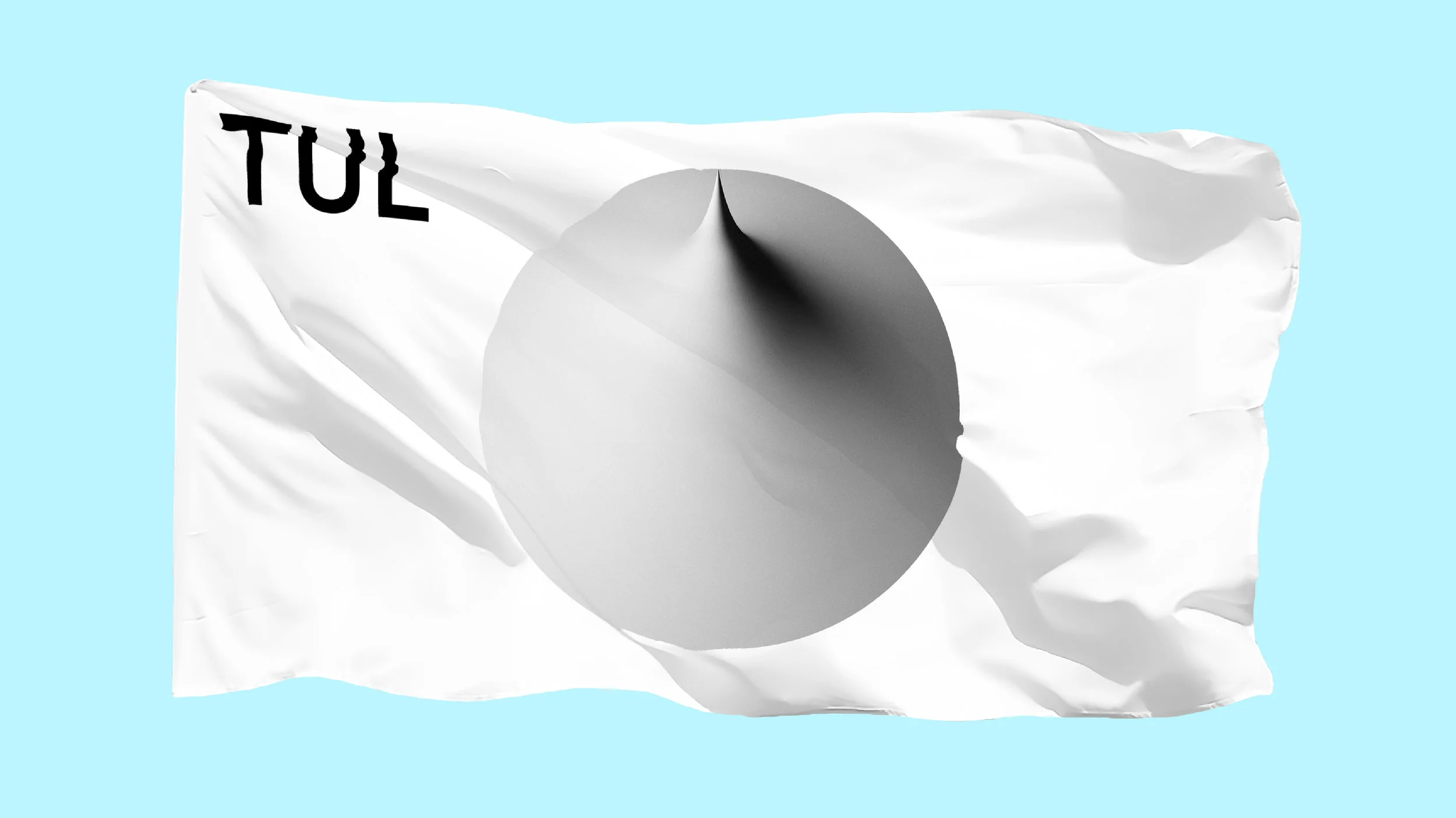
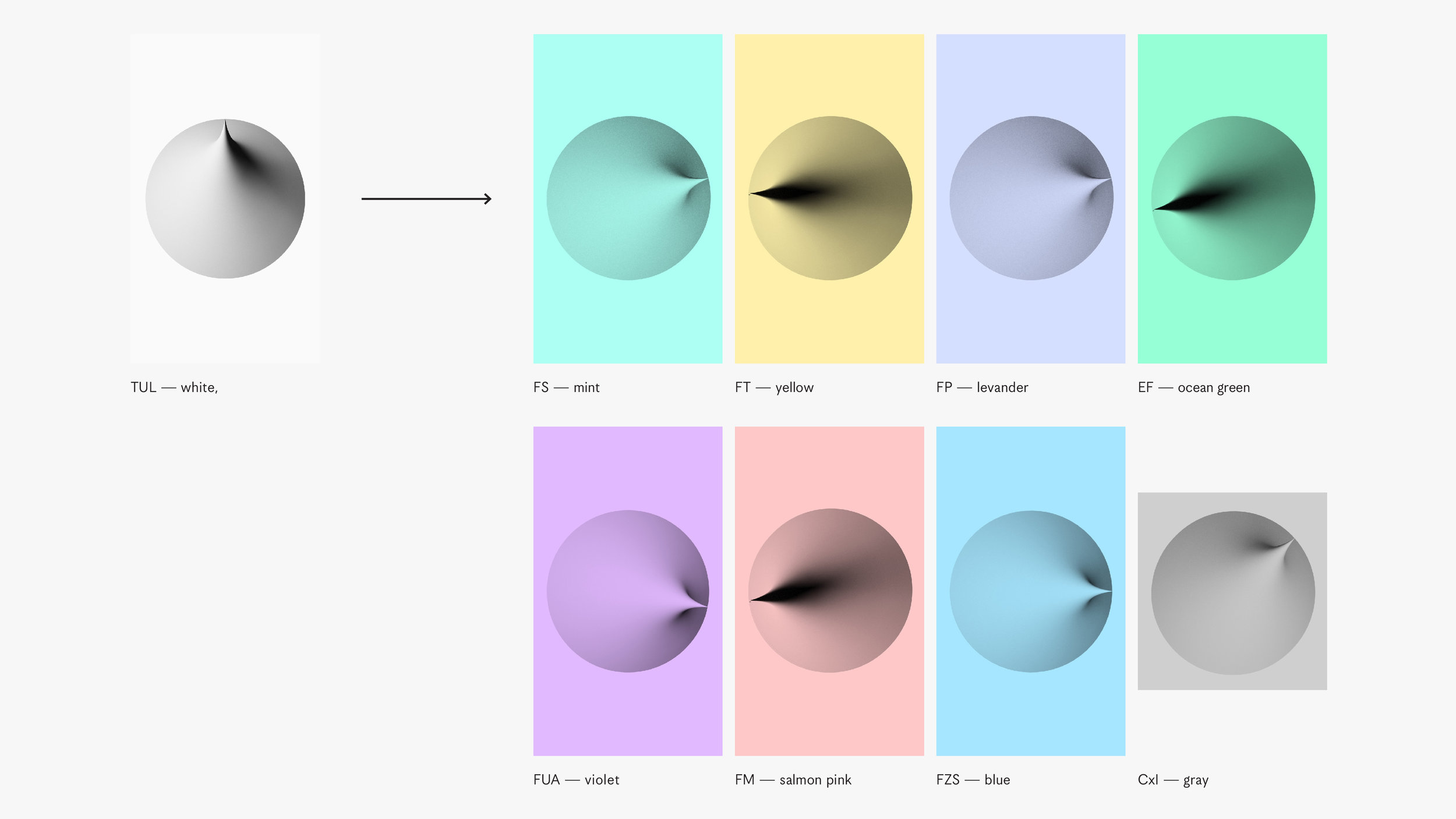
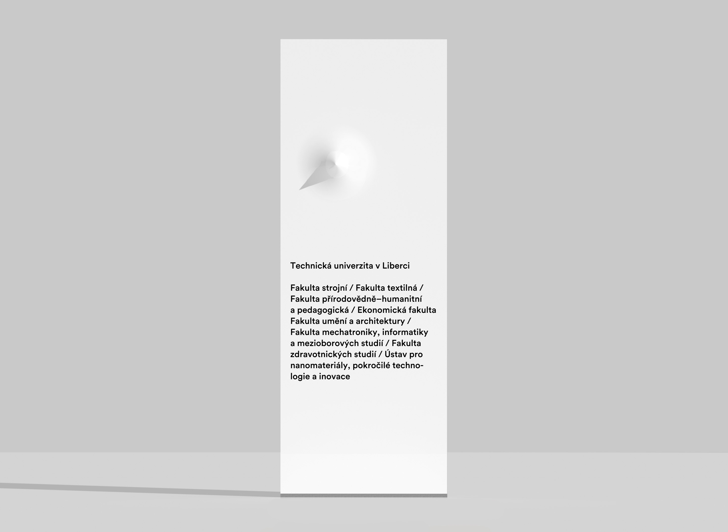
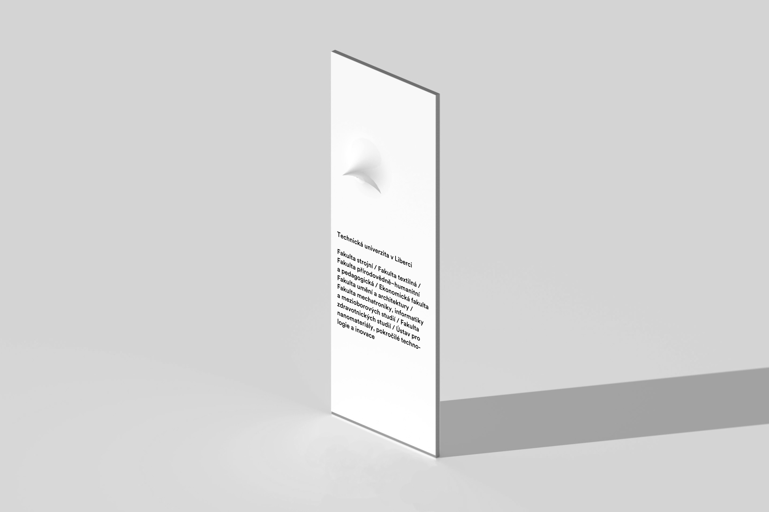
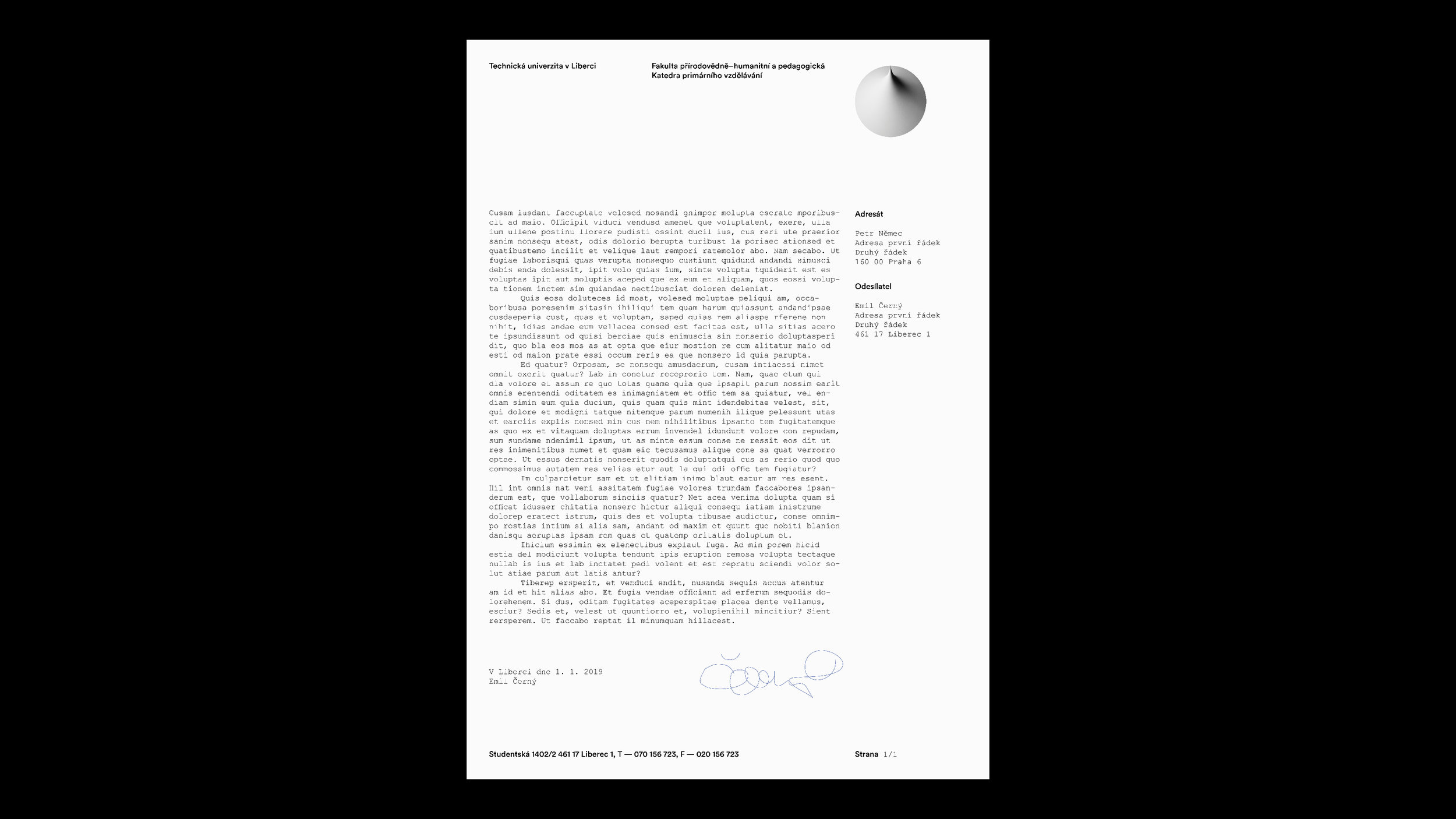
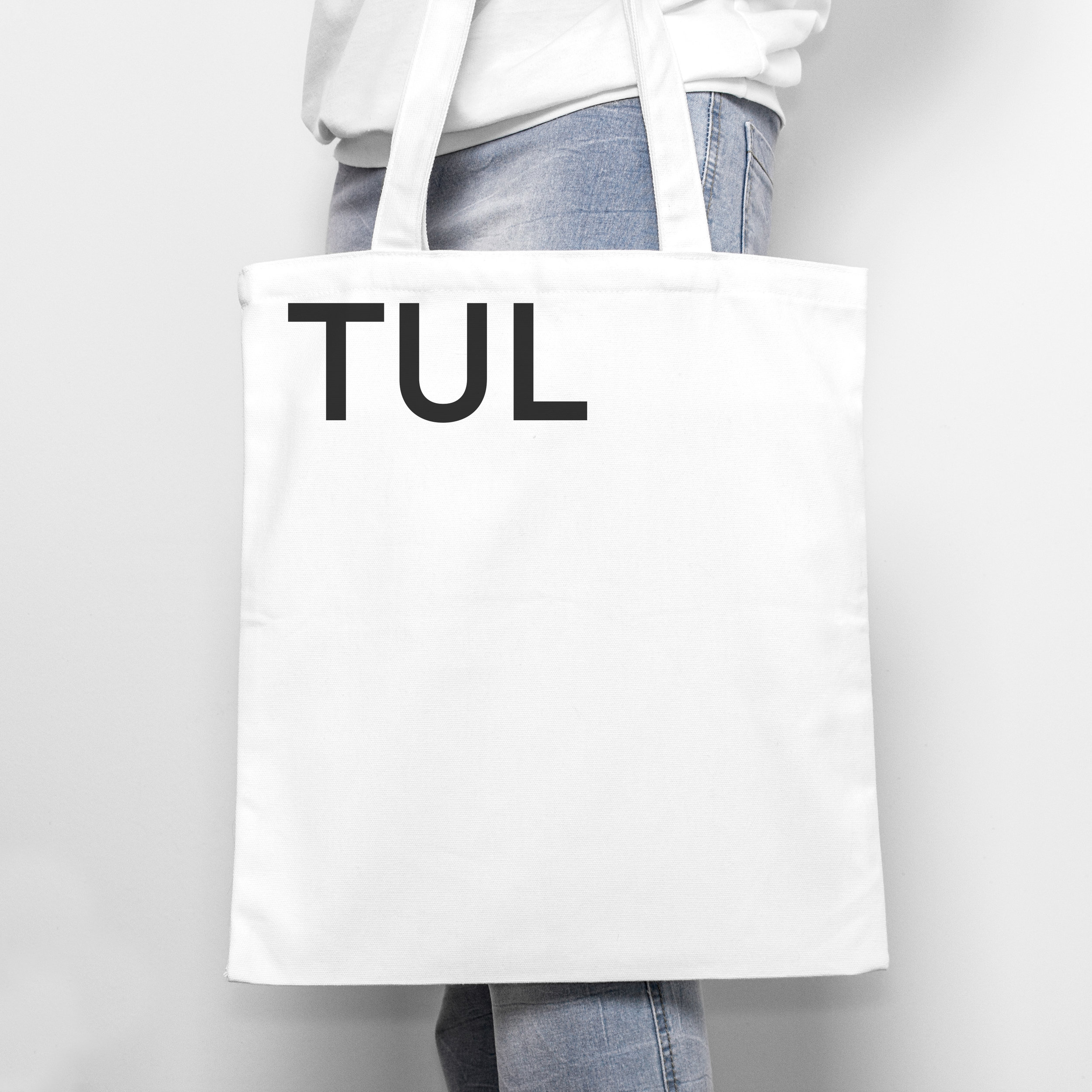
Our proposal evolved from a simple idea of maintaining the previous logo based on the monumental Ještěd Tower, but rethinking its depiction together with completely reimagining the visual identity system. We used axonometric projection technique to capture an abstracted version of Ještěd silhouette, which doubles as the True North symbol. This is also a reference to Technical University of Liberec being the northernmost university in Czech Republic. Expanding on this windrose idea, we created uniquely tailored logos for each faculty by rotating the symbol in directions of their respective locations within the campus. These logos thus double as simple way-finding system originating from the visitor center in campus’ main building, the rectorate. Our multifaceted proposal incorporated a new identity color scheme, typography, website interface design, and a range of application samples.
Aside from solving usual technical and practical challenges, our ambition was to make a step in slightly different direction than most recent cases of university identity redesigns in the country. We were interested in the sense of continuity and shared memory, in a search for ways to advance without abandoning the good that already exists.
デザイン・リード: ヤン・ブラノブセキ (元ビューロー)
プロジェクト・メンバー: カズ・ヨネダ
Design Lead: Jan Vranovský (ex-Bureau)
Project Member: Kaz Yoneda

